Contents
1.0 Introduction
2.0 Understanding Your Data
2.1 Data Terms for HR Specialists
2.2 What Data Should You be Looking at?
2.3 How Much Data do You Need?
2.4 Visualising Your Data
3.0 Making the most of Your Data
3.1 Benchmarking
3.2 Pre-Built Surveys
3.3 Comparing Variables
3.4 Cross-Theme Analysis
3.5 Closing The Feedback Loop
1.0 Introduction
Hi there! This eBook will empower you to make the most of your data once you’ve gathered it.
We’ll do this through the lens of how The Happiness Index platform enables you to analyse your data. Although the principles apply regardless of the platform you’ve adopted, we believe we have some unique features which will supercharge your data strategy. More on that later!
We go into more detail on the specifics of data strategy in our blog. So we’ll include links for those who want all the nitty- gritty!
2.0 Understanding Your Data
Let’s examine some of the common data terms and what they mean for your people data. We’ll also help you to think about what data you should be looking at and how the data you collect can help you discover meaningful insights.
2.1 Data Terms for HR Specialists
Before we go too deep into the eBook, we wanted to share definitions of some of the data terms you’re likely to come across. We’ll use quite a few of these in the next few chapters, so this will help us all be on the same page.
Correlation/Association
Both these terms mean almost the same thing. Often they’re used interchangeably, although sometimes correlation is stronger than association. It’s basically when two types of data are closely tied together. E.g. tall people tend to wear larger shoes.
Causation
Causation is a lot like correlation and association, in that it links two different data sets. The key difference is that while one has an effect on the other, the effect cannot be reversed. E.g. traffic accidents are caused by weather but the weather cannot be impacted by accidents.
Variables
“Variable” is the fancy data name for the pieces of information you put into your survey. E.g. demographic information such as age, gender or race. All of these pieces of information are variables.
Slices (of data, not pizza)
Data slices are a way of looking at the data you have gathered on a more granular level. In our platform, it means breaking down data by a filter so you can look at the detail more closely. E.g. age, gender, location and more.
Response Rate
The percentage of people in your organisation who have responded to your survey.
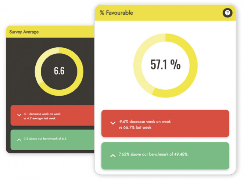
Benchmark
A point of reference. Generally, this looks at averages. We go into lots more detail on this later on.
Averages
Within our platform, an average is a typical value associated with a response. We calculate it by adding together all the responses and then dividing this total by the number of responses.
Ratings
Our platform uses a 1-10 scale to produce data, which means it’s all ratings based and these ratings provide relative information on a given topic/area.
Heatmaps
A heatmap is a data visualisation method. The fancy definition is that it shows the “magnitude of phenomenon”, which is a data-jargony way of saying how big the difference is in the scores.

2.2 What Data Should You be Looking at?
There is a bunch of different kinds of data we believe you should be analysing. Here are the main ones we recommend looking at on a regular basis.
Engagement AND happiness data
It’s important to measure both engagement AND happiness. By leaving emotions out of the equation your organisation is only looking at half the picture.
Quantitative AND qualitative data
Our platform helps you collect both numerical and text-based feedback. Qualitative data adds context and meaning to the numerical scores. This is the real insight!
Demographic data
We enable you to upload your own demographic data into our platform. We can also help you perform a mini-census of your organisation. As our platform guarantees anonymity, many employees feel safer answering about how they identify (for example their gender) through one of our surveys.
Employee lifecycle data
We can help you measure engagement and happiness throughout your employee’s lifecycle. This means we can help you keep track of changes along the way.
Key drivers of engagement AND happiness data
As well as showing you how engaged and happy your people are, we also show you what’s driving those emotions. This means that you can create a people strategy that is based on what your people actually want and need.
Desirable business outcomes
We can also help you to measure desirable business outcomes. We use correlation and regression analysis to correlate all actionable questions within our surveys with engagement output questions.
2.3 How Much Data do You Need?
In an ideal world, you would get 100% feedback on every survey you send out. But this is very unlikely. This then begs the question - how much data do I need before my survey will give me accurate information about my organisation?
Think about aiming for a representative sample. This sits at about 70% of your people. Any lower than this, and we cannot be as confident in your results.
Remember that you need a representative sample at an organisational and group level. If you get 70% feedback at an organisation level, but a small sample from certain teams, locations or job functions, this data will be less accurate.
Starting with a smaller group
A pilot can be super helpful in some instances. But, it’s important to note that you should avoid using feedback obtained from this approach to make big changes at an organisation-wide level. We recommend getting as much feedback and data as possible for company-wide decisions. Although, we realise it isn’t a one-size-fits-all approach.
2.4 Visualising Your Data
At The Happiness Index, we know that data tells human stories. But we also know that not everyone can intuitively understand data stories.
That’s why we’re passionate about helping organisations understand their people data. We highlight the key insights, trends and themes. Most of all we’re dedicated to giving people actionable insights from their data. We believe the best way to do this is through data visualisation.
What do we mean by visualising data?
Visualising data is just what it sounds like - conveying data in a visual form. This could be via graphs, images or diagrams. All of these methods will help you understand your data.
Why visualising data?
There are several reasons why data visualisation is really helpful when it comes to data. There are different ways we help you use the correct data visualisation techniques for each of these situations.
Let’s look at each in turn...
1. You’re dealing with a lot of data
Often when you’re doing people surveys you can be getting large amounts of data. The best way to understand large quantities of data is to visualise it so you can see patterns or trends. Then you can create meaningful actions towards positive change.
How can we help? We provide charts, graphs and visuals and help you organise your data and see key metrics at a glance. Our dashboards are particularly useful: we remove data silos and allow you to see the headlines across all surveys.
Within our reporting we use heatmaps to help you quickly analyse themes and trends, and zone in on particular strengths and weaknesses. We also use radar charts to help you to compare multiple data points at the same time. When you’re comparing different drivers of engagement and employee happiness, you can easily see the distribution.
2. You’re dealing with a lot of non-numerical data
When it comes to people data, you’re often dealing with comments. This means you need to get more creative in how you organise your data so you can spot themes and trends.
How can we help? We use word clouds to help visualise and organise comments. This gives you an overview of which words are most frequently used within your survey comments. Our sentiment analysis data gives you additional context and insight.
Each of the words is also hyperlinked to allow you to see the individual comments that build into the trends. This enables you to see the granular insights, as well as the broad overview.
3. You need to share your data with others
It’s important to share your findings with your team. When you share with others you need to deliver results in a succinct, accessible way. We understand that one of the strongest aspects of data visualisation is its storytelling power.
How can we help? When sharing data, it is key that you provide the correct amount of information for the group you’re talking to. For example, senior leadership will want to see broad strokes and action plans. On the other hand, when sharing with your team you will need to protect anonymity.
Always be as transparent and honest as you can. People will build trust in the programme when they see you providing honest updates and empathetic actions plans.
We have a lot of experience with sharing our data. Our custom reports are customised by audience. We have tailored reports for anyone from leadership to individuals.
Sharing your data
The best way to share data is often in a meeting. This allows you to engage your team in dialogue about the results. So you can celebrate successes and discuss how you will address weaknesses.
For this reason, we also give you the option to download your results as slides, spreadsheets or reports. Our automated slides use a range of charts and graphs to visualise your findings. This allows you to customise, add your own branding or change the order of results.
We also offer bespoke reports. These are created by our in-house data experts, neuroscientists and experienced customer success professionals. They allow you to really understand the full details of your data and give explicit advice on where to focus your efforts. If this is something you are interested in, speak to one of our Customer Success Managers.

3.0 Making the most of Your Data
Let’s examine how our powerful data tools will help you supercharge your people strategy by getting you actionable insights quickly and accurately
3.1 The Power of Benchmarking
Benchmarking is one of the most powerful tools at your disposal as an HR professional. It allows you to accurately assess how well you’re doing, and where your organisation
still has space to improve.
Our benchmarking is particularly powerful because we allow you to look at several layers of data. Sounds complicated but it isn’t.
Organisation-Level Benchmarking
- Top-level benchmarking looking at engagement AND happiness.
- All Pre-Built Surveys include standard questions around engagement and happiness so you can benchmark from your first survey send
How happy are you?
- We launched 8 years ago with just this question!
- Gives you incredible insight into how your people are feeling, thinking and behaving.
- A single figure out of 10 provides immediate insight
Employee Advocacy
- Employee advocacy levels give great insight into how engaged your people are.
- A standard eNPS score can be widely used for external facing purposes.
Question-Level Benchmarking
See benchmarks at an individual individual question level to really understand what is driving engagement and happiness, and compare to other data points within our platform.
Individual questions
- Instant access to data at an individual level.
- Get super granular benchmarking.
- Truly understand what’s driving top level scores, and how your scores shape up.
Neuroscience Themes
- All questions in our Pre-Built Surveys are tagged with a neuroscience theme.
- Used to identify key drivers of employee performance, engagement and happiness.
- Compare internally across the employee lifecycle, time and location, and externally against competitors.
- It's powerful stuff!
Competitor Benchmarking
- Many organisations like to compare their data with competitors.
- Our platform allows you to compare your data against the averages of other organisations that look like yours.
Industry Benchmarking
- Benchmark your feedback results against other organisations within the same industry.
- Compare with competitors or others in your sector.
Organisation Size Benchmarking
- Benchmark your data against organisations of a similar size.
- Compare your results to others who have similar culture challenges.
- Innovative approach.
Internal Benchmarking
- Every organisation is as unique as the people that make it up.
- For this reason, benchmarking internally can be more powerful than against other organisations.
Trended Benchmarking
- Set a benchmark when you join with us, and then compare over time.
- See where your programming is succeeding, keep an eye on problem areas, and spot trends.
Departmental Benchmarking
- Benchmark internal teams, departments or locations against each other.
- Spot best practices and help managers with targeted coaching and advice.
Our benchmarking is particularly powerful because we allow you to look at several layers of data. Sounds complicated but it isn’t!
3.2 The Power of Pre-Built Surveys
We’ve created Pre-Built Surveys which will get to the heart of your people data and help you uncover the key drivers of engagement AND happiness.
We believe that our Pre-Built Surveys are the best way to get quality feedback and improve your people data because they are:
Powered by neuroscience
Every question in our pre-built surveys is underpinned by neuroscience. So you can analyse your results and get insight into how your people are really thinking, feeling and behaving.
Powered by data
Our platform breaks down data silos meaning you can compare across time, location and survey. This gives you true data flexibility.
Powered by instinct
We know that sometimes your instinct as a leader is your best asset. We help you to blend your own knowledge of your organisation with quantitative and qualitative data.
Powered by partnership
Our surveys are compiled by a team of neuroscience and business experts. Together we arm you with the tools and expertise to power your people strategy.
Powered by community
Alongside each of our pre-built surveys, we’ve created a library of knowledge to support you in creating actions. Plus, you can discuss these with our community, to see how others have risen to similar challenges and survey. This gives you true data flexibility.
Powered by vision
Our vision is “Freedom to be Human”. We know that all people are individuals, so we designed our pre-built surveys to speak to as many people as possible.
Powered by people
Ultimately our platform is powered by your people. It is designed to uncover what is important to your people when it comes to their engagement and happiness. Your people are the most powerful resource you have, and our surveys are designed to unlock that power!
3.3 The Power of Variables
One of the ways our product helps you to make the most out of your data is by giving you real insight. Our powerful dashboards and reports make slicing data a doddle. The best way of doing this is by comparing variables.
Here are some of our favourite variables to investigate
Location data
This is a particularly powerful variable to look at. This is because targeted solutions can be implemented in specific locations. A blanket approach could be causing problems, so you may want to tailor your approach by location.
For Example
- Typically see that head office locations score higher overall in surveys than others.
- Often there are differences across countries because of cultural differences.
Top Tip
- If you are unable to discover the root cause of differences, consider sending a Deep Dive survey in the relevant neuroscience area.
- This could survey the affected location to give greater insight.
Demographic data
We often see customers using demographic data to pe deeper into their survey responses. Common demographic data we use include gender and generation, but our filters can be customised based on your needs.
For Example
- Typically women score higher than men.
- Reasons vary between organisations, but this knowledge can help when designing programmes and initiatives.
Top Tip
- HR is often concerned that using demographic data will mean their people won’t answer honestly.
- Building trust with your wider team by showing what the data will be used for and how it is anonymised will minimise this.
Department data
By looking at departments specifically you can build accountability with specific managers or team leaders. This should be done within a wider strategy and a supportive atmosphere. You may be able to take a solution from one department and move it to another team.
For Example
- It’s hard to share specific examples because every department is so unique.
- We look forward to helping you find out about what makes your teams tick!
Top Tip
- You may be keen to drill too deep into departmental data. We would not recommend going into sub-department or highly specific teams.
- Small groups are more likely to be volatile in their feedback and won’t provide accurate data.
3.4 The Power of Cross-Theme Analysis
Our platform gains power from its ability to break down data silos. Our unique Cross-Theme Analysis tool allows you to gain insight from all of the surveys that you have conducted using our Pre-Built Surveys.
Here are five ways our Cross-Theme Analysis tool could help you make the most of your engagement and happiness data:
1. Get an instant, visual read on your data
Your time is money. Our Cross-Theme Analysis tool sits directly on the homepage of your dashboard, so you can see how your organisation is performing at a glance. It reflects the latest overview of how your people are thinking and feeling.
2. Create a people strategy that is flexible & bespoke
Organisations are as unique as the humans that form them. That’s why it’s so important to tailor your people strategy to individual needs and wants. Our tool allows you to keep your people strategy agile and attuned to what your people actually want and need.
3. Dive deeper into your data
Our tool also offers you the opportunity to pe deeper into the data. You can look at which questions on which surveys made up the specific scores you see. By delving deeper into the data, you will be able to create a strategy that aligns with your organisation’s needs
4. Marry quantitative and qualitative data
Our platform uses cutting-edge AI and sentiment analysis to isolate comments as they pertain to the key neuroscience themes. This will allow you to use the comments to ascertain exactly what your people are thinking and feeling and the context.
5. Celebrate your successes
Our Cross-Theme Analysis tool also highlights your strengths. Celebrate your organisation’s strengths, particularly if they’re areas where previously you have been weaker. Highlight successful initiatives that your team will benefit from.
3.5 The Power of Closing The Feedback Loop
One of the most unique things about our platform is our “Close The Feedback Loop” tool which lets you respond to feedback to get more context and help solve problems more effectively.
The tool allows your people to opt in to entering a direct conversation with you around their feedback. Conversations happen in-platform so complete anonymity is preserved. Here are five ways our Close The Feedback Loop tool could help you make the most of your happiness and engagement data:
1. Empower Your People
Our platform empowers individuals to give feedback on their terms. It offers the choice of a follow-up to ensure the respondent’s meaning is fully understood. Closing the feedback loop is optional and the power to toggle it on and off lies with the respondent. Ultimately, giving the power to your people.
2. Build Trust
Because our Close The Feedback Loop tool maintains complete anonymity, it helps to build trust. Anonymity allows your people to answer without fear of any repercussions. A response also builds trust as people will be aware of the attention given to their feedback.
3. Improve psychological safety
Psychological safety is key to building a feedback programme that works well for your organisation. Psychological safety means having a voice. When people feel they can be authentic with their feedback you can rely on the accuracy of your data.
4. Strengthen the feedback strategy
Our Close The Feedback Loop tool adds credibility to, strengthens and deepens your feedback strategy. This is because it proves that feedback isn’t just a box-ticking exercise. Direct dialogue lets your people know what is being done with their feedback.
5. Get direct actionable insight
Benefit from extra information to help inform your decisions and action plans. You can also get input from your people about what they need from you to address their feedback. Plus, extra insight to help you build on successes.
In summary
You can ensure that your programme of activity meets what your people truly want and need - without assumptions. This means you can be certain your efforts will reap the biggest positive impact
•